Triads in Decoration
Triads are difficult to use effectively in decoration. The delicate balance of colors in area, tone and intensity, perplexing enough when only two important hues are employed, becomes very much more perplexing in the case of three important hues. Certain color theorists of the last century worked out formulas designed to guide the decorator in the quantitative distribution of color areas; but these formulas are so clumsy and inadequate, and so subject in practice to a thousand modifications and derogations, that it is far safer to ignore them altogether. Indeed, it is far safer for the beginner to let the triads alone until through study and experience he has acquired the sure feeling for color which makes all rules for dealing with it merely a hindrance.
Besides their theoretical complexity, triad schemes are in practice hard to execute by reason of the difficulty of finding decorative materials in which the colors are properly distributed. In fact this is often impossible unless the time and money available permit having things specially designed and made to order. In the case of our chosen dominant hue, for example, a triad scheme would employ yellow-orange, blue-green and red-violet. Since two of these hues are cold, the triad would probably be disagreeable in low tones. Therefore, in doing a room-say a sitting room or boudoir-the decorator, in order to make the cold colors light enough to be agreeable, would break all the colors with light gray, which would give him a light grayish tan, sage green, and lavender. Executed in the best things to be found ready-made in the shops, these colors would be likely to result in a somewhat stiff and unsympathetic arrangement of grayish tan walls, sage green plain carpet, lavender on some of the furniture, repeated in pictures, ceramics, cushions, or lamps, and a mixture of lavender, green and grayish tan in printed linen hangings and slip covers for some of the furniture. To achieve anything like a subtle harmony he would have to wait several months and pay roundly for a special rug containing the three colors properly distributed, while fringes and gimps would have to be specially made, lamp bases and picture frames specially toned, and a screen or a decorative panel for the over-mantle specially painted.
Red, blue and yellow do not present the same difficulties, because of the great range of rugs and drapery stuffs containing those hues in the lower values, as well as the range of fabrics containing rose, cream and azure in the high values. Even here, however, the difficulties are considerable. Both analogous and complementary harmonies may under suitable conditions be widened by accents to include a wide gamut of colors, and therefore to meet practically every color requirement.
Having chosen the hues to be used in a given room, the decorator must determine the areas upon which each hue is to appear. It is clear that no formulas of constant value can be adduced to cover these distributions, since the effect of a color will depend far more upon its purity than upon the superficial area it covers. Indeed, there is but one rule which can never be disregarded, namely, that the mind must not be left in any perplexity as to the dominant hue. For example, in a room with light golden brown walls, tan ceiling, brown furniture, and olive rug, hangings and furniture coverings, there is a chance for perplexity as to which color is dominant, and such perplexity would mean a lack of unity and therefore of beauty in the room. Here the decorator will first of all see to it that the yellow element in both hues is clearly apparent. If this seems insufficient, olive and brown furniture coverings, or olive and gold hangings, or both, may be substituted for the plain olive. In other words, by some method or other the dominant hue must be made clearly apparent to the mind.
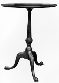
PLATE XII.- Small occasional tables are not only necessary in grouping furniture for convenient use, but they also serve to relieve a room of the effect of heaviness due to exclusive use of large pieces, and to give it a note of gaiety and animation. The table shown above is an example of fine proportion and of perfect adjustment of ornament to structure.
In triad schemes the two secondary hues may be distributed pretty much according to personal fancy. These two colors should, however, be so distributed that the total effect of one, as determined both by area and intensity, is perceptibly greater than that of the other.
In complementary harmonies the general rule of practice is to increase the relative area of the dominant hue as the purity of the wall color is increased. In a yellow and violet room, for example, when the walls are of an almost neutral yellowish-gray the quantities of yellow and violet used in the other surfaces of the room would be as nearly as practicable equal; assuming, for the purposes of this illustration, that these colors were employed in equal intensity. With yellow walls of one-fourth intensity the other areas would contain about twice as much yellow as violet, and with yellow walls of one-half intensity about three times as much yellow as violet. With yellow and violet of unequal intensity the relative areas would be altered to allow for the differences. The method, of course, applies, roughly, to all pairs of complementaries. It is illustrated graphically in Figure 48, in which the upper section of each oblong represents the wall area and the lower sections all the other colored areas.
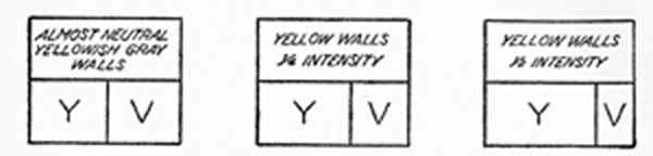
FIGURE 48.- In complementary schemes the area of the dominant hue, other things being equal, is increased directly with the purity of the wall color.
 "Finally! Step-by-Step Guidebooks Show